Time Series Data
rpi.analyticsdojo.com
!pwd
#Load pandas
import pandas as pd
#Set urls
url_train = 'https://raw.githubusercontent.com/llSourcell/Time_Series_Prediction/master/Train_SU63ISt.csv'
url_test= 'https://raw.githubusercontent.com/llSourcell/Time_Series_Prediction/master/Test_0qrQsBZ.csv'
#Pandas can now load urls directly. No more wget.
train = pd.read_csv(url_train)
test = pd.read_csv(url_test)
Code adopted from https://github.com/llSourcell/Time_Series_Prediction/blob/master/Time%20Series.ipynb
#Load pandas
import pandas as pd
#Set urls
url_train = 'https://raw.githubusercontent.com/llSourcell/Time_Series_Prediction/master/Train_SU63ISt.csv'
url_test= 'https://raw.githubusercontent.com/llSourcell/Time_Series_Prediction/master/Test_0qrQsBZ.csv'
#Pandas can now load urls directly. No more wget.
train = pd.read_csv(url_train)
test = pd.read_csv(url_test)
import numpy as np
import matplotlib.pyplot as plt
from datetime import datetime
from pandas import Series
import warnings
warnings.filterwarnings("ignore")
plt.style.use('fivethirtyeight')
train.head(5)
train.shape
test.head(5)
test.shape
Set Column to Datetime
To have a time series data, we need to tell pandas that we have a specific column with the date and time. While we have named it datetime, we have to take the further step of updateing it.
#Let's look at the data. Note a slightly different way to find data type.
print(train['Datetime'][0], "Data Type:", train.Datetime.dtypes)
#Update to Datetime
train['Datetime'] = pd.to_datetime(train.Datetime, format = '%d-%m-%Y %H:%M')
test['Datetime'] = pd.to_datetime(test.Datetime, format = '%d-%m-%Y %H:%M')
#Let's look at the data
print(train['Datetime'][0], "Data Type:", train.Datetime.dtypes)
Dates are full of Features
- We can extract numerous features out of our data.
- Examples. Year, Month, Day, Hour, Day of Week, Weekend, etc.
#Performing operations on multiple data frames.
for i in (train, test):
    i['year'] = i.Datetime.dt.year
    i['month'] = i.Datetime.dt.month
    i['day']= i.Datetime.dt.day
    i['hour']=i.Datetime.dt.hour
#Now let's get the day of the week using datetime.
train['day_of_week'] = train['Datetime'].dt.dayofweek
temp = train['Datetime']
#Is it a weekend?
def is_weekend(day):
    if day.dayofweek == 5 or day.dayofweek == 6:
        return 1
    else:
        return 0

train['weekend'] = train['Datetime'].apply(is_weekend)
train.head(5)
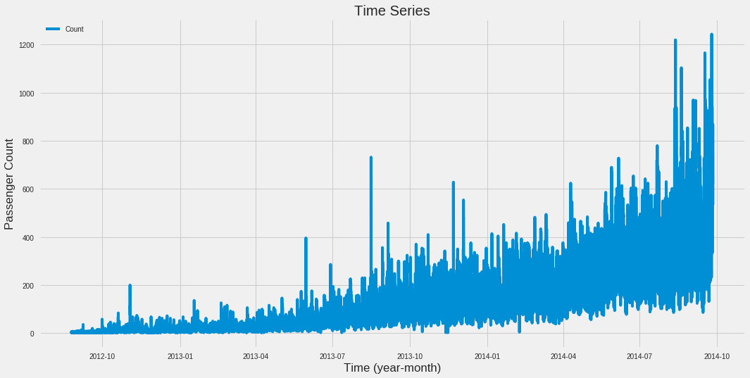
Plot Value (Count) vs Time
This will plot the entire range.
train.index = train['Datetime']
df = train.drop('ID',1)
ts = df['Count']
plt.figure(figsize = (16,8))
plt.plot(ts)
plt.title("Time Series")
plt.xlabel("Time (year-month)")
plt.ylabel("Passenger Count")
plt.legend(loc = 'best')
* Exploratory Analysis*
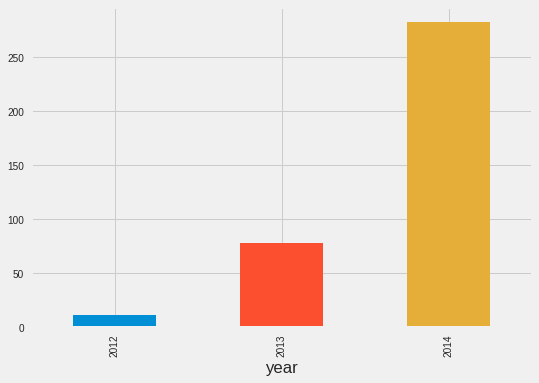
- This indicates the value for the mean level of the count for each year.
train.groupby('year')['Count'].mean().plot.bar()
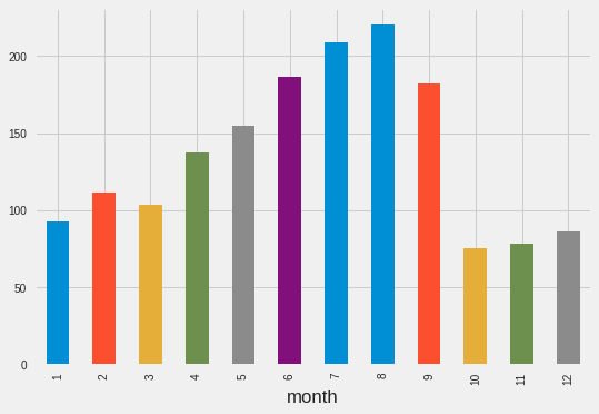
train.groupby('month')['Count'].mean().plot.bar()
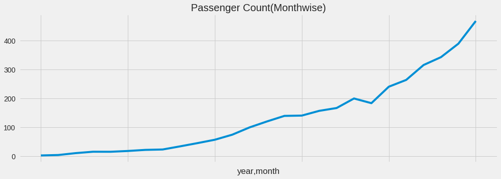
temp = train.groupby(['year', 'month'])['Count'].mean()
temp.plot(figsize =(15,5), title = "Passenger Count(Monthwise)", fontsize = 14)
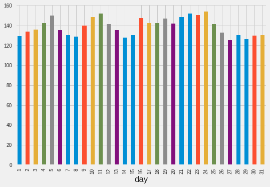
train.groupby('day') ['Count'].mean().plot.bar()
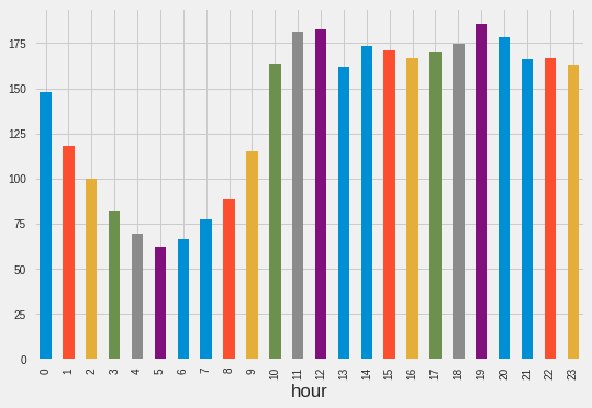
train.groupby('hour')['Count'].mean().plot.bar()
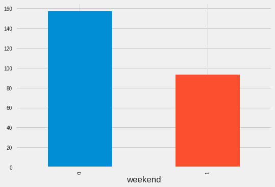
train.groupby('weekend') ['Count'].mean().plot.bar()
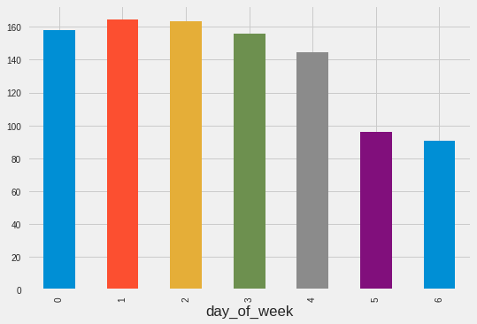
train.groupby('day_of_week') ['Count'].mean().plot.bar()
Resample data
Convenience method for frequency conversion and resampling of time series Often you don’t want to have the same
train.Timestamp = pd.to_datetime(train.Datetime, format = '%d-%m-%y %H:%M')
#Here we need to set the index to a timestamp
train.index = train.Timestamp

#Hourly
hourly = train.resample('H').mean()

#Daily
daily = train.resample('D').mean()

#Weekly
weekly = train.resample('W').mean()

#Monthly
monthly = train.resample('M').mean()
hourly.head(5)
monthly.head(5)
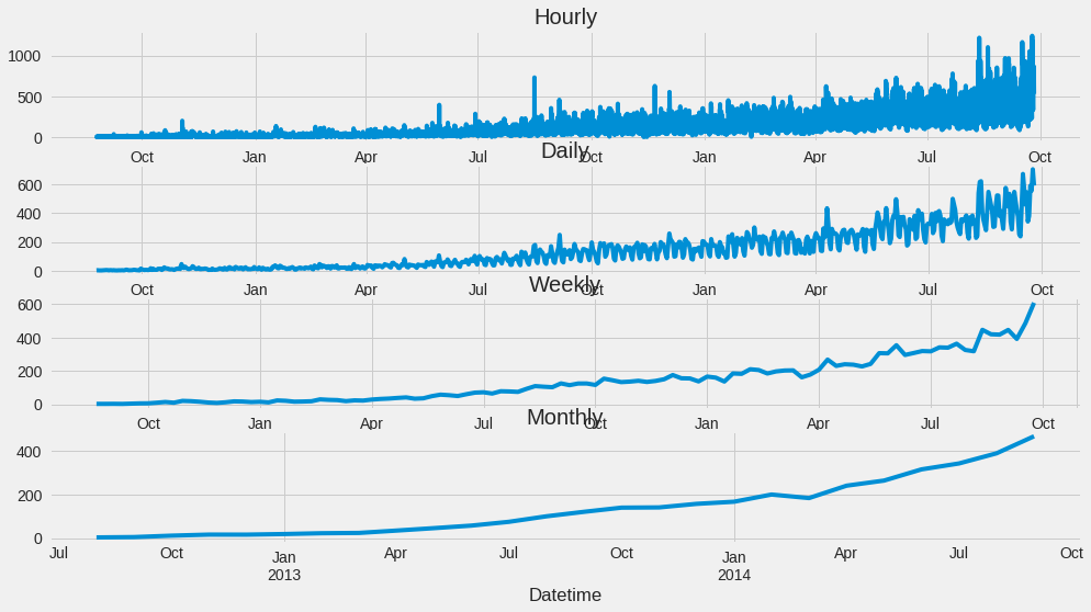
#Plots...notice the variablity.
fig,axs = plt.subplots(4,1)

hourly.Count.plot(figsize = (15,8), title = "Hourly", fontsize = 14, ax = axs[0])
daily.Count.plot(figsize = (15,8), title = "Daily", fontsize = 14, ax = axs[1])
weekly.Count.plot(figsize = (15,8), title = "Weekly", fontsize = 14, ax = axs[2])
monthly.Count.plot(figsize = (15,8), title = "Monthly", fontsize = 14, ax = axs[3])
test.Timestamp = pd.to_datetime(test.Datetime, format='%d-%m-%Y %H:%M')
test.index = test.Timestamp

#Converting to Daily mean
test = test.resample('D').mean()

train.Timestamp = pd.to_datetime(train.Datetime, format='%d-%m-%Y %H:%M')
train.index = train.Timestamp

#Converting to Daily mean
train = train.resample('D').mean()
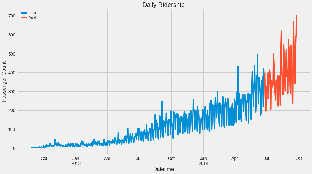
Divide data into training and validation -A key aspect of what you use for training data is what time periods are selected.
- You can’t just select a random sample, but need to split by a specific time.
Train = train.ix['2012-08-25':'2014-06-24']
valid = train.ix['2014-06-25':'2014-09-25']
Train.shape,valid.shape
Train.Count.plot(figsize = (15,8), title = 'Daily Ridership', fontsize = 14, label = 'Train')
valid.Count.plot(figsize = (15,8), title = 'Daily Ridership', fontsize =14, label = 'Valid')
plt.xlabel('Datetime')
plt.ylabel('Passenger Count')
plt.legend(loc = 'best')
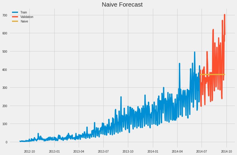
** Naive Approach**
- For the Naive model, we will just include the most recent value as our preduction for the rest of the training set.
dd = np.asarray(Train.Count)
y_hat =valid.copy()
y_hat['naive']= dd[len(dd)- 1] #this just selects the last value.
plt.figure(figsize = (12,8))
plt.plot(Train.index, Train['Count'],label = 'Train')
plt.plot(valid.index, valid['Count'], label = 'Validation')
plt.plot(y_hat.index, y_hat['naive'],  label = 'Naive')
plt.legend(loc = 'best')
plt.title('Naive Forecast')
* Calculate RMS Error for Naive Approach*
from sklearn.metrics import mean_squared_error
from math import sqrt
rmse = sqrt(mean_squared_error(valid.Count, y_hat.naive))
rmse
Moving Average Approach and Calculate RMS Error for Moving Average Approach
- It is also possible to forcast based on a “rolling” window
- This will create a smoothing effect
y_hat_avg = valid.copy()
y_hat_avg['moving_average_forecast'] = Train['Count'].rolling(10).mean().iloc[-1]
plt.figure(figsize = (15,5))
plt.plot(Train['Count'], label = 'Train')
plt.plot(valid['Count'], label = 'Validation')
plt.plot(y_hat_avg['moving_average_forecast'], label = 'Moving Average Forecast with 10 Observations')
plt.legend(loc = 'best')
plt.show()
rmse = sqrt(mean_squared_error(valid['Count'], y_hat_avg['moving_average_forecast']))
rmse
y_hat_avg = valid.copy()
y_hat_avg['moving_average_forecast'] = Train['Count'].rolling(20).mean().iloc[-1]
plt.figure(figsize = (15,5))
plt.plot(Train['Count'], label = 'Train')
plt.plot(valid['Count'], label = 'Validation')
plt.plot(y_hat_avg['moving_average_forecast'],label = 'Moving Average Forecast with 20 Observations')
plt.legend(loc = 'best')
plt.show()
rmse = sqrt(mean_squared_error(valid['Count'], y_hat_avg['moving_average_forecast']))
rmse
y_hat_avg = valid.copy()
y_hat_avg['moving_average_forecast']= Train['Count'].rolling(50).mean().iloc[-1]
plt.figure(figsize = (15,5))
plt.plot(Train['Count'], label = 'Train')
plt.plot(valid['Count'], label = 'Validation')
plt.plot(y_hat_avg['moving_average_forecast'], label = "Moving Average Forecast with 50 Observations")
plt.legend(loc = 'best')
plt.show()
rmse = sqrt(mean_squared_error(valid['Count'], y_hat_avg['moving_average_forecast']))
rmse

